
Justin Timberlake Landing Page

Justin Timberlake recently released his first song as a lead artist in almost 7 years. That’s right; 7 years! To turn this release into an event, Justin and his team at Uprising Creative made a gorgeous landing page. I think it’s a stellar example of everything a landing page should be.
Let’s take a look at how the landing page dresses up the release of “Suit & Tie.”
Press Play
The largest element, and the most important, is the streaming player. From a design perspective, the video player draws the most attention through its use of size and color relative to the other elements on the page.
As a result, pressing play is the first thing visitors are encouraged to do.
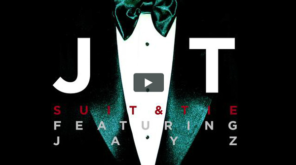
Above all, JT wants people to listen to “Suit and Tie.” This may seem obvious, but I’ve seen other pages go straight for the sale first. In 2013, it doesn’t make sense to encourage people to buy music before listening to it.
The Open Letter
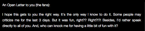
Directly under the stream is a personal, conversational letter from Justin to his fans. I love this because it does two things.
- It sets the tone: Expectations and excitement for Justin’s release reached a fever pitch when he released a teaser video last week. With this open letter to his fans, Justin sets the tone for this event. He uses the word “fun” five separate times, and the style of the letter bounces with a conversational voice. It’s like Justin is saying, “Let’s all chill out and just enjoy this for what it is: a good time.”
- Establishes a deeper connection: After reading the open letter, we feel closer to Justin. Readers get background on how this new project came about. Justin opens up to how he feels about all of it, too. This kind of thing creates a stronger bond between artist and fan.
Download on iTunes
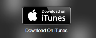
Also known as the conversion. If the listener loves the song, a purchase link is only a few pixels away. The open letter works towards this goal, too.
If the open letter strengthens the bond between Justin and a fan (which it definitely can), that person may feel a stronger urge to buy the song and support Justin’s fun, exciting new adventure.
The Mailing List
![]()
And if listening, reading, and buying doesn’t sate a fan’s appetite, they can subscribe to the mailing list.
I think the messaging is important here: “Join the mailing list for more info.” It says why we should join the mailing list. It’s a fine point, but so many people forget to include it.
The mailing list’s “why” works wonderfully with the open letter. There’s a solid amount of information in the letter, but it leaves fans wanting more. Justin wraps it up by teasing fans and letting them know there’s more to come.
Cue the mailing list to find out just that. It’s super responsive; filling out the simple form takes seconds.
Share

At the end of this experience, visitors are encouraged to share it with friends and followers. Not much to say here, but note MySpace conveniently gets its own row.
Creating a 20/20 Experience
All of these things are fairly standard to a landing page. What separates this page from others is the cohesive design and an injection of purpose and personality into every element.
Map out your release objectives. Work with designers and developers who get your style and vision. Hone the language you use. And with a killer track (and maybe Jay-Z), you can give your fans a wonderful experience like Uprising Creative and Justin Timberlake.
(See original post at musicthinktank.com)
Jason Hollis | Feb 13, 2013 at 9:49 pm
Jason Hollis liked this on Facebook.